 Inverity
Responsive Images Done Right: srcset, sizes, Art Direction
Date Published
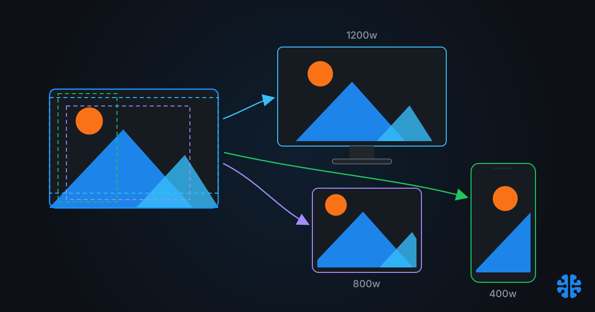
Responsive images are a solved problem that almost nobody solves. The syntax shipped over a decade ago, browser support sits at 96.68% globally (caniuse, srcset, live July 2026), and 42% of mobile pages now use srcset (Web Almanac 2024 Media, HTTP Archive). Adoption is fine. Accuracy is not.
The same HTTP Archive dataset shows the median sizes attribute is 43% too large on desktop. Not off by a rounding error. Forty-three percent. That single attribute quietly decides which file the browser downloads, and most teams set it once, let the layout drift, and never look at it again.
This guide covers what responsive image markup is actually for, where implementations fail, what that failure costs in bytes, and why sizes="auto" is the first genuinely new fix in years.
TL;DR >- 42% of mobile pages usesrcset, but only 9.3% use<picture>, roughly one picture user per four-plus srcset users (Web Almanac 2024, HTTP Archive)- The mediansizesattribute is 16% too large on mobile and 43% too large on desktop, and desktop accuracy has gotten worse since 2022 (same source)- Inaccuratesizeswastes 179 KB per page on desktop at p75 and 920 KB at p90 (same source)-sizes="auto"withloading="lazy"is now in the HTML spec and shipped in Chromium: the browser uses the real laid-out width, no manual math- One in five desktopsizesvalues is wrong enough to make the browser pick a suboptimal file outright
What are the three jobs of responsive image markup?
Responsive image markup does three distinct jobs: resolution switching, art direction, and format negotiation. Confusing them is the root of most broken implementations. In the wild, srcset dominates: 42% of mobile pages use it, while only 9.3% use <picture> (Web Almanac 2024 Media). Each job has exactly one correct tool.
Resolution switching: srcset with w descriptors plus sizes
This is the common case. Same image, same crop, different pixel dimensions for different viewports and screen densities. You list candidates with w descriptors and tell the browser how wide the image will render via sizes. The browser does the selection math for you.
Among pages that use srcset, w descriptors are the majority choice at 62% on mobile, versus 15% for the older x density descriptors (Web Almanac 2024 Media). That is the right instinct. x descriptors only handle screen density, not layout width, so they cannot save bytes when your image renders at 320px on a phone and 800px on a desktop.
Art direction: the picture element with media queries
Art direction means changing the image itself, not just its size. A wide landscape hero on desktop becomes a tight square crop on mobile so the subject stays legible. That requires <picture> with media conditions, because the crop decision is yours, not the browser's.
Use it sparingly and deliberately. Every <source> variant is another asset to produce, store, and keep in sync.
Format negotiation: the picture element with type
The third job is serving AVIF or WebP to browsers that support them, with a fallback. In markup, that is <picture> with type attributes. Among the minority of pages using <picture>, format switching is actually the top use case at roughly 46%, edging out art direction at about 40% (Web Almanac 2024 Media).
Worth saying plainly: if you deliver through an image CDN that does content-negotiation on the Accept header, you do not need <picture> for formats at all. One URL, server picks the format. The markup route exists for teams serving static files. There is more to format choice than markup, though; we've written about where the newest codecs genuinely win and where they don't in neural compression vs traditional codecs.
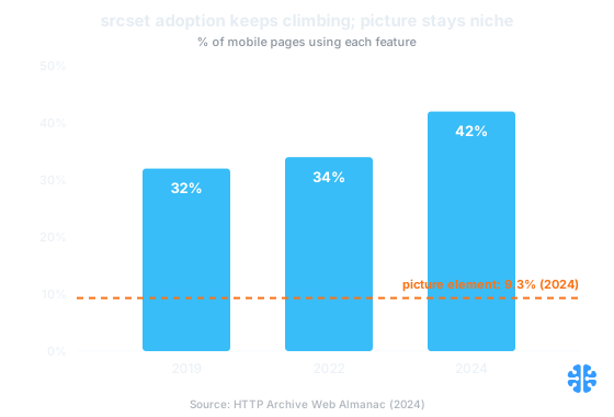
srcset adoption keeps climbing while the picture element stays niche at 9.3% (Web Almanac 2024 Media, HTTP Archive).
The sizes attribute is where implementations fail
Because sizes is a layout promise made before layout happens. The browser's preload scanner picks a srcset candidate before CSS is parsed, so it trusts your sizes value over reality. Developers set it once; layouts drift with every redesign. The result: median sizes is 16% too large on mobile and 43% too large on desktop (Web Almanac 2024 Media).
Read that trend line carefully. Desktop sizes accuracy is worse than it was in 2022. This is not a knowledge problem that time is fixing. It is a maintenance problem that time is compounding. The attribute is invisible in visual QA, it never throws an error, and the page looks identical whether it is right or wrong. The only symptom is bytes.
The 100vw default trap
Here is the most common silent mistake. If you write srcset and omit sizes, the spec defines the default as 100vw: full viewport width. On a desktop viewport, that tells the browser your 400px-wide product thumbnail will render at 1920px, so it dutifully downloads the largest candidate you offered.
You wrote more markup, generated more variants, and shipped more bytes than a plain src would have. This default is a direct cause of the desktop median sitting 43% too large. If you take one thing from this post: never ship srcset with w descriptors and no sizes attribute.
How wrong does sizes have to be before it matters?
Small errors are forgiven. The browser rounds to the nearest candidate in your srcset list, so a sizes value that is 5% off usually lands on the same file. The Almanac's threshold question is the right one: how often is the error big enough to change the selected resource?
On desktop, the answer is 1 in 5. Twenty percent of desktop sizes attributes are inaccurate enough that the browser picks a suboptimal srcset resource (Web Almanac 2024 Media). One in five responsive images on desktop is doing measurable harm while looking perfectly implemented in code review.
The real cost of inaccurate sizes attributes
More than most teams' entire image-optimization win. At the 75th percentile, inaccurate sizes wastes 179 KB per page on desktop and 55 KB on mobile. At the 90th percentile, that grows to 920 KB on desktop and 400 KB on mobile (Web Almanac 2024 Media).
Wasted image bytes from inaccurate | Mobile | Desktop |
|---|---|---|
p75 (typical bad page) | 55 KB | 179 KB |
p90 (worst decile) | 400 KB | 920 KB |
Source: Web Almanac 2024 Media chapter, HTTP Archive (Nov 2024).
Put those numbers in context. Teams will spend a sprint migrating JPEG to AVIF to save a comparable amount, then leave 920 KB on the table because a sidebar was added in 2023 and nobody re-derived the sizes math. The compression work and the markup work are the same budget; only one of them gets attention. This is the same blind spot we cover in why page speed is still broken in 2026: the industry optimizes what tools measure loudly and ignores what fails silently.
And note which side of the ledger is worse. Mobile gets the performance scrutiny, but the byte waste concentrates on desktop, where 100vw defaults and stale breakpoint math inflate every request.
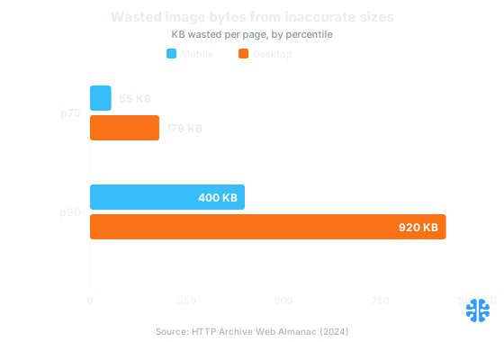
Wasted bytes from inaccurate sizes concentrate on desktop: 179 KB at p75 and 920 KB at p90 (Web Almanac 2024 Media, HTTP Archive).
Does sizes="auto" actually fix this?
For lazy-loaded images, yes, and it is the first real fix rather than another best practice to maintain. sizes="auto" is now in the HTML spec and shipped in Chromium. With loading="lazy", the browser defers selection until layout is known, then uses the image's actual laid-out width. The manual math, and the drift, disappear.
The mechanism is worth understanding. The whole reason sizes exists is that the preload scanner requests images before CSS is parsed. A lazy-loaded image, by definition, is not requested during that early scan. By the time it is needed, layout has happened and the browser knows the true rendered width. sizes="auto" simply lets the browser use that knowledge instead of your stale estimate.
```html
<img
src="/products/lens-800.jpg"
srcset="/products/lens-400.jpg 400w,
/products/lens-800.jpg 800w,
/products/lens-1200.jpg 1200w"
sizes="auto"
loading="lazy"
width="800" height="600"
alt="Camera lens on a workbench, aperture blades visible"
/>
```
Two caveats keep this from being universal. First, it only applies to lazy-loaded images, and your LCP image must never be lazy-loaded. The Almanac found loading="lazy" on a third of all websites, and 9.5% of pages lazy-load their LCP image, which delays the most important paint on the page (Web Almanac 2024 Media). For above-the-fold images you still need hand-written sizes, written honestly.
Second, browsers without support fall back to treating auto as 100vw, so appending fallback lengths is advised, for example sizes="auto, (max-width: 640px) 100vw, 50vw" (MDN, HTMLImageElement.sizes). With srcset support itself at 96.68% globally (caniuse) and auto newer than that, the fallback string is cheap insurance.
How many srcset variants should you generate, and how?
Three to five width variants per image covers most layouts; past that, returns diminish because the browser rounds to the nearest candidate anyway. Space them by byte cost, not by device list: roughly a 2x range between smallest and largest common rendered widths, with a step or two between.
A practical recipe:
- Measure real rendered widths. Open the page at your top three viewport sizes and record what the image actually occupies. Do not trust the CSS you remember writing.
- Generate candidates around those widths. For a card image rendering at 320 / 480 / 640 CSS pixels, candidates at 320w, 640w, 960w, and 1280w cover 1x and 2x densities without a combinatorial explosion.
- Write
sizesfrom the layout, or usesizes="auto"for everything lazy-loaded below the fold. - Set explicit
widthandheight. Only 32% of images ship intrinsic dimensions, up just 4 points since 2022 (Web Almanac 2024 Media), and missing dimensions are a direct layout-shift cost. - Re-audit after every layout change. The 43%-too-large desktop median is what "set and forget" looks like at scale.
If maintaining this by hand sounds fragile, that is because it is. An image CDN with server-side resizing and automatic srcset generation eliminates the by-hand breakpoint math entirely: one master asset, variants derived on demand. Just be clear-eyed that a CDN handles the resizing job, not the judgment jobs; we've made that argument at length in why your CDN isn't solving your image problem.
Does any of this help Core Web Vitals directly? Yes, through LCP. On most pages the LCP element is an image, and a sizes error that ships a 2x-too-large file delays that paint on every constrained connection. Our Core Web Vitals image playbook covers the measurement side.
How we think about this at Inverity
One quality-gate observation, then we'll leave the vendor hat off. At Inverity we treat responsive markup accuracy as a measurable property, not a code-review vibe: rendered width versus delivered width is a number you can compute for every image on every template, and the Almanac data shows what happens when nobody computes it. A claim like "our images are responsive" should be checkable. Most aren't.
FAQ
What's the difference between srcset and the picture element, and when do I need each?
srcset handles resolution switching: same image, multiple sizes, browser chooses. <picture> handles decisions you must control: different crops per viewport (art direction) or format fallbacks. Usage reflects the split: 42% of mobile pages use srcset, only 9.3% use <picture> (Web Almanac 2024). Default to srcset; reach for <picture> only when the image itself must change.
What happens if I use srcset without a sizes attribute?
The browser assumes the default, 100vw, meaning it believes your image spans the full viewport. On desktop it then downloads your largest candidate for even a small thumbnail. This default is a direct contributor to the median desktop sizes value running 43% too large (Web Almanac 2024 Media). Always write sizes, or use sizes="auto" with lazy loading.
How many image sizes should I generate for srcset?
Three to five width variants is enough for most layouts. Derive them from real rendered widths at your main viewports, covering 1x and 2x density, rather than from a device list. The browser rounds to the nearest candidate, so tightly packed variants add storage and pipeline cost without changing what gets downloaded.
Does srcset help SEO or Core Web Vitals?
It helps LCP, which is a Core Web Vitals metric and a ranking input. The LCP element is an image on most pages, and accurate sizes prevents oversized downloads that delay it. The inverse hurts too: 9.5% of pages lazy-load their LCP image, actively delaying their most important paint (Web Almanac 2024 Media).
Can the browser download the wrong image if my sizes attribute is inaccurate?
Yes, and it does so often. On desktop, 1 in 5 sizes attributes is wrong enough that the browser selects a suboptimal srcset resource, and the waste reaches 920 KB per page at the 90th percentile (Web Almanac 2024 Media). The browser trusts your promise over the real layout; a wrong promise means a wrong file.