 Inverity
The True Cost of Over-Compression: The Metric You Miss
Date Published
TL;DR >- Over-compression is a cost your dashboards cannot see. Page-weight, LCP, and Lighthouse all reward fewer bytes, so crushing an image looks like pure win on every chart you watch.- The costs land somewhere you don't instrument: US consumers returned $890 billion in 2024, 16.9% of total retail sales (NRF and Happy Returns, 2024), and online apparel returns run near 22%, driven mostly by fit and expectation gaps (ICSC via Statista, 2025).- Image quality is empirically tied to perceived trustworthiness in peer-to-peer marketplaces (Zhang et al., 2018). The direct link from over-compression to returns is a reasoned argument, not a measured fact. We label it as such throughout.- The honest takeaway: measure quality perceptually, not just by byte count, because the metric that catches over-compression is not in your build pipeline.
Here is a claim you should distrust, including when we make a softer version of it: "over-compressing images costs you sales." The internet is full of that line attached to confident numbers, high-resolution photos convert 94% higher, and most of those numbers trace back to a single recirculated source with no methodology. We are not going to repeat them. A claim that cannot be checked is not a claim; it is an advertisement.
What we can do is something more useful and more honest. There is a real, structural reason over-compression tends to cost more than teams think, and it has nothing to do with any specific conversion number. It is a measurement problem. Over-compression is cheap to see when it helps you and nearly impossible to see when it hurts you. That asymmetry, not a fabricated effect size, is the true cost.
What is the true cost of over-compression?
The true cost is a hidden one: over-compression trades a visible, celebrated saving for an invisible, uninstrumented loss. Shrinking a hero from 300 KB to 60 KB shows up instantly on every performance chart. The banding it adds to the sky shows up nowhere your team is looking. The books record only the win.
Scale sets the stakes for why the loss side matters. US consumers returned $890 billion of merchandise in 2024, equal to 16.9% of total retail sales (NRF and Happy Returns, 2024). That figure comes from a fall-2024 study of 2,007 consumers who had returned an online purchase plus 249 retail professionals at companies above $500 million in revenue (NRF and Happy Returns, 2024). Returns are not a rounding error. They are a sixth of retail.
We want to be precise about the connection, because the honesty is the point. We cannot show you a dataset that isolates image over-compression as a cause of those returns. Nobody can; the direct causal data is thin to nonexistent. What we can show is a chain of verifiable facts that makes the risk plausible, and then label the bridge between them as an argument rather than a measurement.
Citation capsule: US consumers returned $890 billion in 2024, 16.9% of total retail sales, per a study of 2,007 online returners and 249 large-retailer professionals (NRF and Happy Returns, 2024). Over-compression is not a proven driver of that total, but it degrades exactly the product imagery shoppers rely on to avoid returns.
Why doesn't over-compression show up in your Lighthouse score?
Because every metric in your pipeline is pointed the wrong way to catch it. Lighthouse, page-weight budgets, and Largest Contentful Paint all improve when images get smaller. Images are the largest single resource on the median page, about 911 KB of mobile page weight in 2025 (Web Almanac 2025), so compressing them harder is the fastest way to make every dashboard greener.
This is the measurement asymmetry, and it is the core of the whole argument. Over-compression produces a positive signal on the metrics you watch and a negative signal only on metrics you don't have. Banding, blocking, and color shift do not raise a page-weight alarm, do not slow LCP, and do not move bounce rate in any way you can attribute. They are quality events, and your performance stack does not measure quality. It measures bytes and time.
So the incentive gradient runs one direction. An engineer optimizing to a Lighthouse target is rewarded for compressing until something breaks, but the thing that breaks is not on the scoreboard. The greenest score and the over-compressed image are frequently the same commit. This is why we argue, repeatedly, that file size is the wrong metric to optimize in isolation, and why Core Web Vitals for images needs a perceptual guardrail beside it.
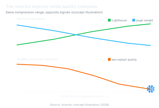
The metrics you watch improve as quality quietly collapses over the same range (Source: Inverity concept illustration, 2026).
The returns problem your pipeline never instruments
Returns are large, expectation-driven, and structurally broken, which is exactly the environment where image quality could matter. Online apparel returns run around 22%, far above the roughly 6.2% rate for in-store purchases, and apparel and footwear top the return charts, mostly over fit and sizing (ICSC via Statista, 2025). When a shopper cannot touch the product, the photo is the product, and the photo is what you compressed.
The returns experience itself is a known weak spot. Baymard Institute found that 54% of e-commerce sites have substantial UX issues in their returns flow (Baymard Institute). That does not implicate compression, but it shows returns are already a high-friction, high-cost surface where any additional expectation gap compounds. A product that looked richer on screen than in the box widens exactly that gap.
Now the labeled step, stated plainly. The move from "returns are driven by expectation gaps" to "over-compression widens those gaps and therefore lifts returns" is our reasoned argument. It is not a measured finding, and we have not seen a credible dataset that proves it. We find the logic sound: compression artifacts most damage color fidelity and surface detail, which are the attributes shoppers use to set expectations. But logic is not evidence, and we will not dress it up as one.
Layer | What it is | Verifiable? |
|---|---|---|
Returns are massive | $890B, 16.9% of retail in 2024 (NRF, 2024) | Yes, Tier 1 |
Returns are expectation-driven | Apparel ~22% online vs ~6.2% in-store, mostly fit (ICSC via Statista, 2025) | Yes |
Image quality shapes trust | Linked to perceived trustworthiness in P2P markets (Zhang et al., 2018) | Yes, academic |
Over-compression lifts returns | Degraded imagery widens expectation gaps | No: our reasoned argument |
Does compression actually change what shoppers trust?
There is real evidence that image quality moves trust, and there is no honest way to convert it into a returns number. In a study of peer-to-peer marketplaces, image quality was empirically linked to perceived trustworthiness of listings (Zhang et al., 2018). We are deliberately not quoting an effect size, because we have not extracted one from the paper, and inventing precision would betray the whole point of this post.
What the finding supports is modest and useful. Shoppers read image quality as a signal about the seller and the product, not just as decoration. A crisp, accurate photo says "legitimate," while a blotchy, banded one nudges the opposite way, below the level of conscious judgment. Over-compression is one way, among many, to push an image toward the second category. That is enough to justify caution without justifying a fabricated coefficient.
So treat the trust link as a direction, not a dial. It tells you that quality has downstream value, and it tells you nothing about how many dollars a given quality drop costs your specific catalog. Anyone who hands you that dollar figure with confidence is selling something. The verifiable position is: quality signals trust, returns are enormous and expectation-driven, and crushing your product photos plays with both. This is the same verifiability ethos behind why blanket compression hurts your CMS.
The images that break first under aggressive compression
Smooth gradients and flat brand fills break first, and they are the ones you most want intact. Aggressive JPEG compression shows two signature failures: banding, where a smooth gradient collapses into visible stair-steps, and blocking, where the 8x8 transform grid becomes visible as tiled squares. Skies, studio backdrops, soft shadows, and solid brand colors are where both appear earliest and most obviously.
The cruel part is that these are high-value surfaces. A brand's signature color rendered as a banded approximation is an accuracy failure on the one element the brand controls most tightly. A luxury product shot against a graduated backdrop is precisely where blocking cheapens the perceived product. The images that carry the most brand and purchase weight are the images with the least tolerance for over-compression, which is the inverse of how a blanket quality setting treats them.
This is why per-image reasoning beats a global slider. A flat UI screenshot and a gradient hero have opposite failure modes, and one compression setting cannot serve both. The fix is content-aware: measure what each image can lose before a human notices, and stop there. We develop that method in content-adaptive per-image quality, and it is why compression should be perceptual, not uniform.
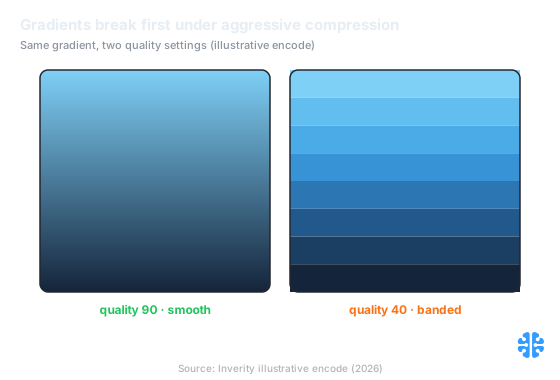
Smooth gradients break first: quality 90 holds, quality 40 bands (Source: Inverity illustrative encode, 2026).
How do you measure a cost that hides?
You install the missing instrument: a perceptual quality gate that runs beside your byte budget. The reason over-compression escapes notice is that no standard pipeline stage measures perceived quality. Add one. Score each image with a perceptual metric before it ships, and treat a quality floor as a build-failing condition the same way you treat a size ceiling.
Concretely, that means three things working together. First, keep your byte budget, because bytes still matter for speed. Second, add a perceptual floor so an image cannot be compressed below the point a human would notice degradation. Third, pay special attention to gradient-heavy and brand-critical assets, which need a higher floor than a busy photograph. The pairing catches the exact case a Lighthouse score misses: a lighter file that also looks worse.
At Inverity, this is the whole thesis: measure perceived quality, prove it held, and make the quality floor as enforceable as the size ceiling. But the principle is vendor-neutral. Any team can add a perceptual check to its pipeline and stop flying blind on the one cost its dashboards were never built to see. For the measurement theory, see measuring quality the way humans see it; for tying it to money, see measuring compression ROI; and for the wider framework, our complete guide to image compression. The sibling discipline of holding a budget without over-spending lives in compression budgets that hold.
FAQ
Does compression affect sales, or is that a photographer's pitch?
Honestly, the direct causal data is thin. We can verify that returns hit $890 billion in 2024 (NRF, 2024) and that image quality shapes perceived trust (Zhang et al., 2018). The claim that over-compression specifically costs sales is a reasoned argument, not a measured fact. Treat confident percentages with suspicion.
What JPEG quality is "too low"?
There is no universal number, which is the point. As a reasoned rule of thumb, we avoid pushing photographic JPEG below roughly quality 75, and we set a higher floor for gradient-heavy or brand-critical images. This is judgment, not a measured threshold. The reliable answer is a perceptual metric per image, not a global slider setting.
Why do brand colors look off after compression?
Because compression discards color information first. Chroma subsampling and quantization reduce color precision to save bytes, which hits flat, saturated brand fills hardest. The result is banding or a subtle hue shift on the exact color a brand guards most tightly. Flat, saturated regions need a higher quality floor than busy photographic areas.
What are banding and blocking artifacts, and which images show them worst?
Banding turns a smooth gradient into visible stair-steps; blocking makes JPEG's 8x8 transform grid appear as tiled squares. Both surface earliest on smooth, low-detail regions: skies, studio backdrops, soft shadows, and solid brand colors. Busy, textured photos hide artifacts far better, which is why one compression setting cannot fairly serve both types.
How do I measure whether over-compression costs me anything?
Add a perceptual quality gate to your pipeline, since page-weight and Lighthouse cannot see quality loss. Score each image against a perceptual metric and fail the build below a quality floor, mirroring how you enforce a size ceiling. For attribution, isolate quality as a variable in a controlled test rather than trusting borrowed conversion percentages.